We've had more than a few people ask us how to animate variable font properties. Software like After Effects does not yet support variable fonts (installed vfonts don't even show up in the app) which is a bummer. The same can be said for Premiere, Final Cut Pro, all the places you'd like to be able to make the text move! Drawbot is one option, if you know or are willing to learn Python. But we have a simple method to animate in a familiar setting: basic HTML/CSS! The only caveat is to not play the animation on an infinite loop. Why? Keep reading.
Let's take a look at this basic animation of the variable font we're using on our site that has 2 axes: width and weight.
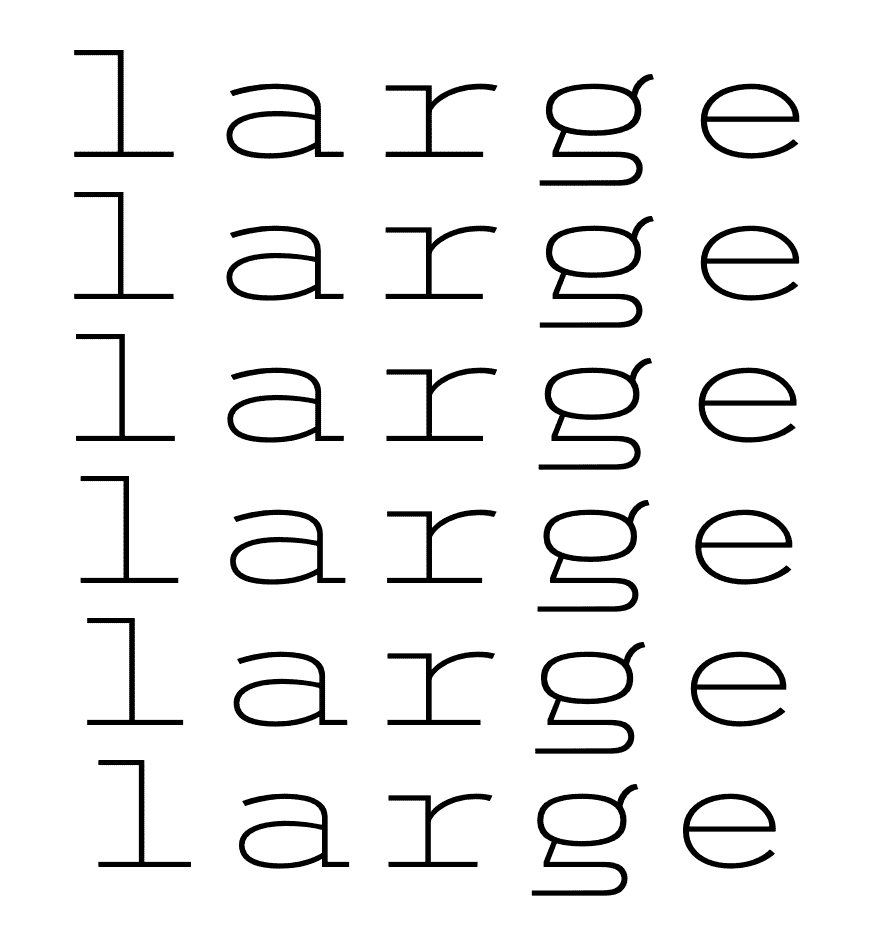 A simple looping keyframe animation, with staggered delay on each subsequent copy. This is a gif, we'll get to that in a second
First we loaded the webfont into the page using a familiar method, but with the suffix "-variations" on our format. Variable TTF fonts will work, but support for that isn't as widespread as WOFF2 (which in our opinion works great).
@font-face {

font-family: 'trispace';

src: url('Trispace.woff2') format('woff2-variations');

}
Then for the html element we just typed our word into in a standard p tag six times. The fun part comes next, and that's choosing how to animate that word. We can control the weight and width axes using font-variation-settings in our CSS. Check out the finished animation CSS, which we named "wacky", specified it to last 5 seconds, and loop infinitely (not recommended for deployment, but we'll get to that shortly):
@keyframes wacky 5s infinite {

0%   {font-variation-settings: "wght" 100, "wdth" 50 ; }

25%   {font-variation-settings: "wght" 100, "wdth" 200; }

50%   {font-variation-settings: "wght" 900, "wdth" 200; }

75%   {font-variation-settings: "wght" 900, "wdth" 50;  }

100% {font-variation-settings: "wght" 100, "wdth" 50 ;}

}
That's a basic keyframe animation, setting the start of our animation – 0% – to a thin weight (100) and a narrow width (50). These values are determined by the font, not you, so you'll need to know the max/min values (which you can find out if you install one and check it in Adobe Illustrator - OR, go drop the file on wakamaifondue.com). The rest of the keyframing is straightforward: at 25% the font stretches out using the "wdth" value while staying light, and then at 50% it stays stretched but then goes heavy, using the "wght" value. Easy, enough, right? And the finished CSS:
p {

animation:  wacky infinite;

animation-duration: 5s;

animation-timing-function: ease;

font-size: 10vh;

margin: 0vw auto;

padding: 0;

line-height: 1;

font-weight: normal;

}

p:nth-child(2) {animation-delay: .1s}

p:nth-child(3) {animation-delay: .2s}

p:nth-child(4) {animation-delay: .3s}

p:nth-child(5) {animation-delay: .4s}

p:nth-child(6) {animation-delay: .5s}
We left it black text on a white background, but because this is just CSS that's super easy and stuff for you to change. Here is a live demo of the above animation on CodePen. Let's look at another example 👇
 Animating only the weight (font-variation-settings: "wght" __;) with CSS
So we changed the colors because that's easy, and instead of repeating the same word we broke up a word using span tags. Like our previous example, this uses one animation but spreads it across each letter, with a slight delay, to get the growth effect. Here's all of the code for that:
@keyframes bigger {
0% {font-variation-settings: "wght" 100, "wdth" 70; }
50%   {font-variation-settings: "wght" 900, "wdth" 70; }
100%   {font-variation-settings: "wght" 100, "wdth" 70; }
}
p span {
animation:  bigger infinite;
animation-duration: 2s;
animation-timing-function: ease;
font-variation-settings: "wdth" 70;
}
p span:nth-child(2) {animation-delay: .1s}
p span:nth-child(3) {animation-delay: .2s}
p span:nth-child(4) {animation-delay: .3s}
p span:nth-child(5) {animation-delay: .4s}
p span:nth-child(6) {animation-delay: .5s}
p span:nth-child(7) {animation-delay: .6s}
So the overall width is unchanging, and because this particular font evolved out of a monospace font the glyph widths remain consistent between weights (thin takes up the same space as black).
But that's the animation, in a browser, which we mentioned not to deploy if you're looping infinitely. Why? Because if you let it sit there for a while (minutes) your CPU's fan might kick on, and local cache space could fill up. Not good, since it puts a burden on the user. This is one of the reasons why we've embedded animated GIFs in this blog post, and elsewhere on our site. Once the GIF loads, it's good to go. Not only that, it's sharable. You can email a GIF, text a GIF, tweet a GIF. It's simpler to distribute than code, even if it might weigh more (bandwidth-wise) up front.
 Quicktime works well and will give you a few different save options.
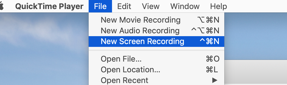
How do we make our GIFs? Well you have a few options, but the basic premise is: record your screen. We like to do this on a Mac with Gif Brewery although Giphy has an app and there are probably countless others like this. These will record your screen as a GIF which is great, but why stop there? You could also record the screen as HD video, simply by using Quicktime.
Our favorite method was a combination of these. We to created several "pages" of simple HTML/CSS to act as different "shots" for this video below, and recorded the screen using Quicktime.
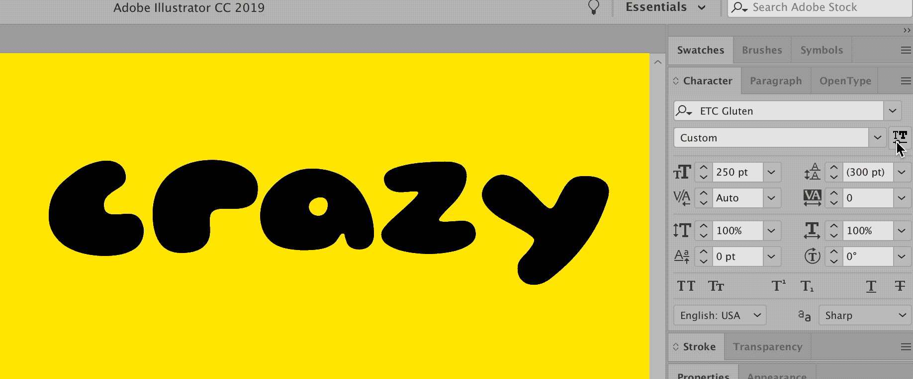
If writing CSS or any code isn't your thing, you can do basic animation (changing only the weight of one element, for instance) by designing what you need in Illustrator and using any of these screen capture methods while you adjust the variable slider property of your choice. You'll just want to make sure you go to the View menu to Hide Edges and Hide Bounding Box.
 This is fine.
Are there different ways to animate variable fonts? Sure. Are there better ways to do it? Probably. This works for us, but we'd love to hear and see what you're doing 👋